NJ Transit Mobile App Design
A streamlined NJ Transit app redesign focused on simplifying navigation, improving ticketing, and enhancing real-time updates for a smoother commuter experience.
CLIENT
SERVICES
ROLE
DATE
NJ Transit
UI & UX Design
UX Research
Independent Project:
Designer + Researcher
January 2025
BACKGROUND
Overview
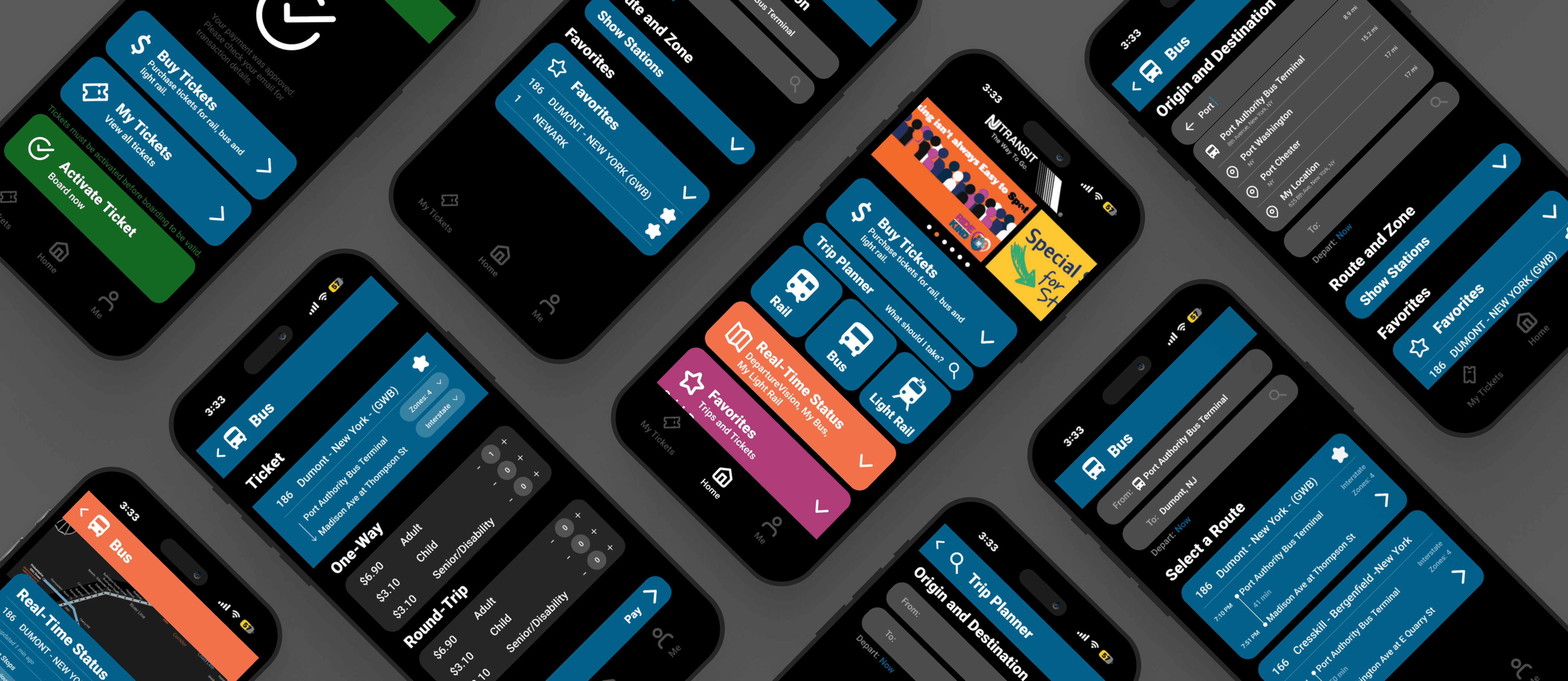
The NJ Transit application enables individuals to: Organize journeys traversing train, bus, and light rail systems. Buy and authenticate digital tickets. Receive live service changes and notifications.
Motivation:
As a lifelong New Jersey resident, I’ve experienced firsthand the inefficiencies of the NJ Transit app and have shared this frustration with friends and family.
Motivated by these challenges, I set out to reimagine a redesign that enhances usability, reliability, and overall user experience of the app.
During this project, I:
Conducted user research to identify pain points and commuter needs.
Redesigned the trip-planning and ticketing experience for better navigation.
Improved real-time transit updates and accessibility features.
problem
The NJ Transit app’s ticket booking process is overly complicated, requiring too many steps and unclear navigation, leading to confusion and frustration for commuters. The lack of real-time service updates makes it difficult for users to efficiently plan their trips, often resulting in delays or missed connections.
Solution
A streamlined mobile ticketing system with a clear, step-by-step booking flow, reducing unnecessary steps and improving usability. Enhancing the trip-planning experience with real-time service updates, route recommendations, and a more intuitive interface will help commuters navigate NJ Transit with ease.
RESEARCH + ANALYSIS
User Feedback
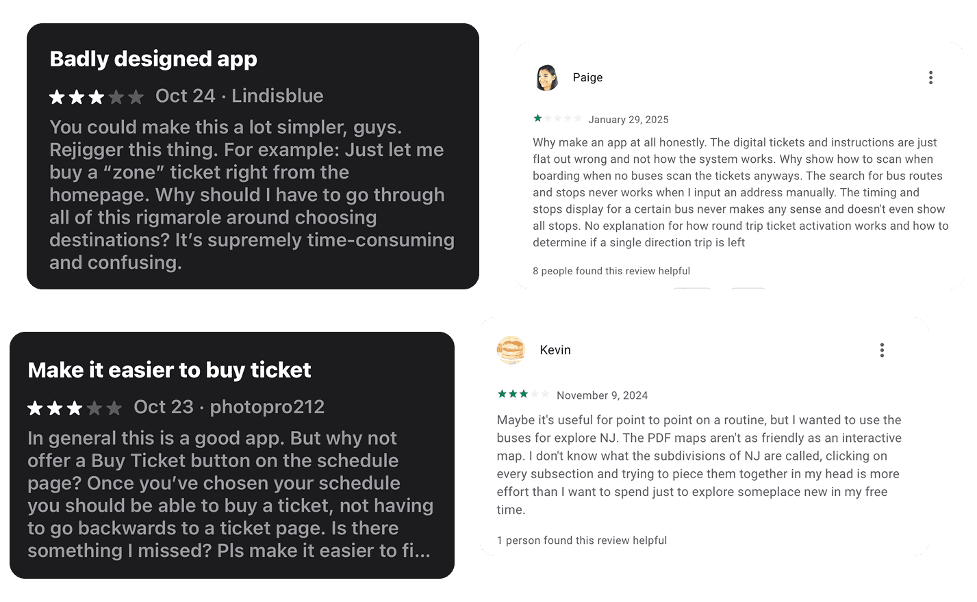
Online
App Store
Google Play
Reddit Discussions
Social Media (Twitter, Facebook)
In-person
Interviews
Anecdotal stories
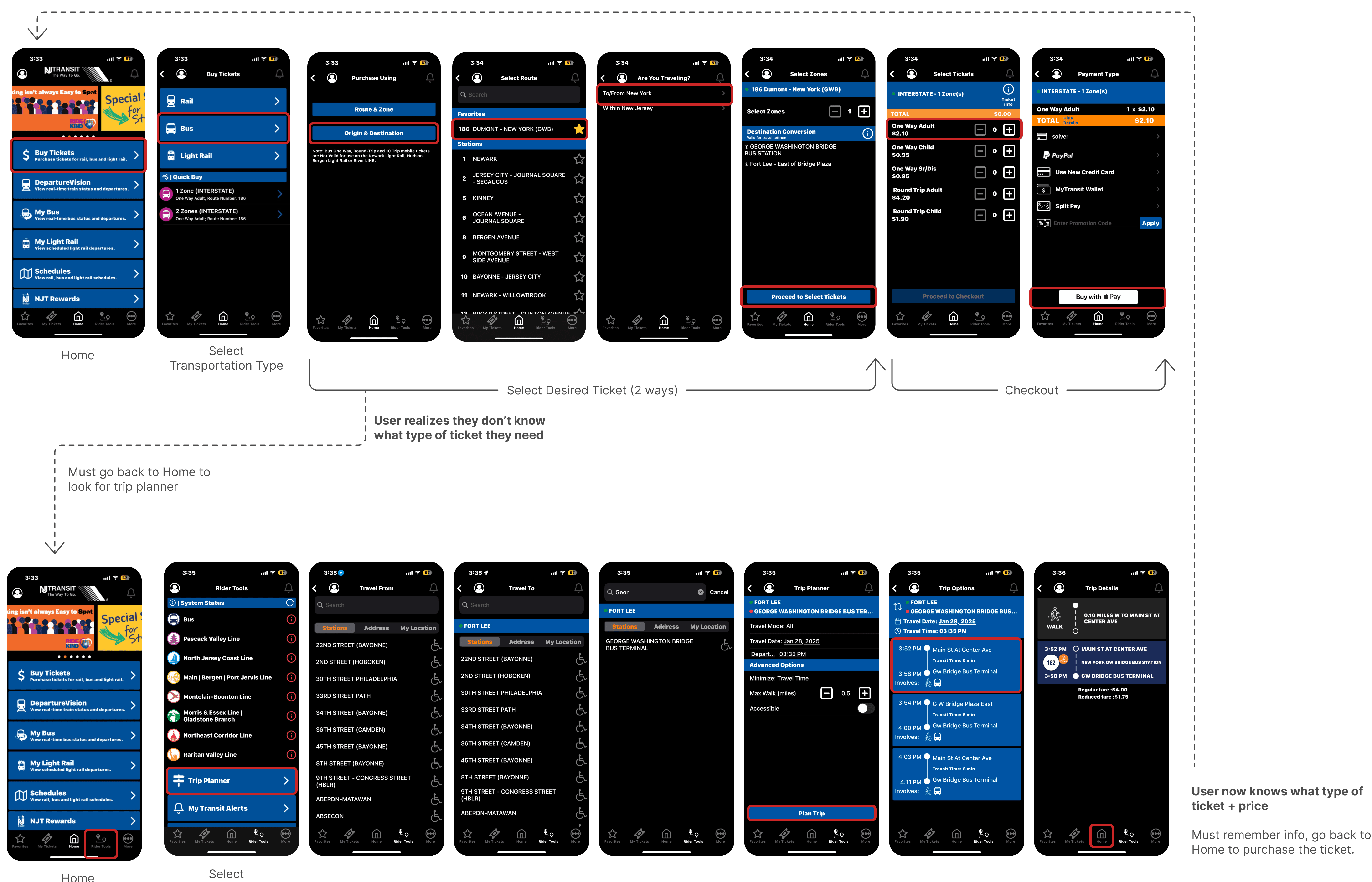
These are the steps a user would have to take in the app to figure out which ticket they need and purchase one.
Common Challenges Identified
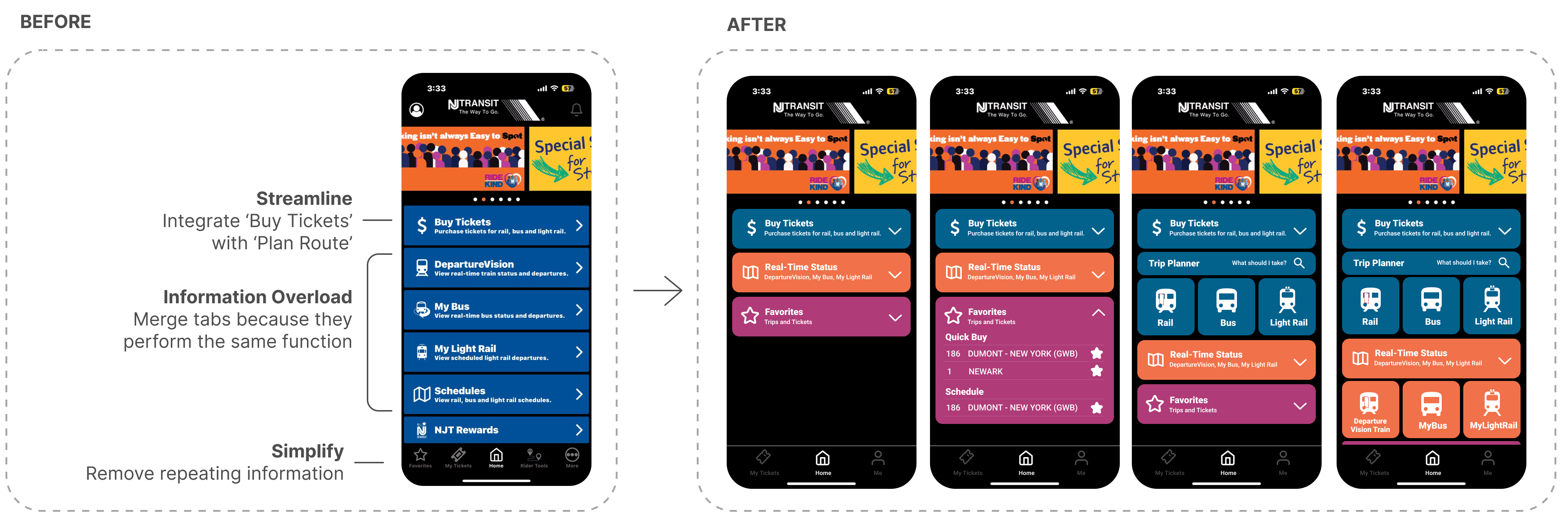
Cumbersome User Flow (too many steps !) - Performing basic tasks requires navigating through multiple unnecessary pages, making the experience slow and frustrating.
Disjointed Ticketing Flow – Trip planning and ticket purchasing are separate processes, creating unnecessary friction. The "Previous Tickets" button is awkwardly placed with no clear call to action.
Cluttered Home Screen – Information overload with no clear hierarchy, making it difficult for users to find what they need quickly.
Navigation Issues – The hamburger menu repeats content found on the bottom navigation bar.
Unclear Real-Time Updates – "Departure Vision" is not integrated into trip planning and requires multiple unnecessary steps to access.
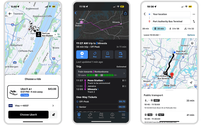
Competitive Analysis
To identify best practices for the NJ Transit app redesign, I analyzed three other transportation apps: MTA, Uber, and Google Maps.
Shared Features & Best Practices
Seamless Payment – Uber’s integrated ride finder + checkout process simplify the experience
Real-Time Updates – Live tracking and service alerts keep users informed before and during travel.
Intuitive Navigation – Bottom navigation bar, simplified home screen, and color-coded functions offer easy readability.
DESIGN
Home Page Redesign
Common Challenges Identified
PROTOTYPE