NJ Transit App Feature Redesign
This personal project aims to improve and simplify the mobile ticket-purchasing experience for app users.
PRODUCT
SERVICES
DATE
NJ Transit Mobile App
UI & UX Design
UX Research
November 2024

NJ transit
BACKGROUND
the problem
The NJ Transit app separates trip planning and ticket purchasing, creating unnecessary friction for users.
Many find the process confusing and unintuitive, leading to frustration and delays
The Goal
Combine trip planning and ticket purchasing into a seamless, user-friendly workflow that minimizes decision fatigue and maximizes efficiency.
RESEARCH
User Interviews
Interview regular NJ Transit commuters to understand their pain points and needs. Focus on their experience with planning trips and purchasing tickets.
Competitive Analysis
Study apps like Citymapper, Transit App, or Amtrak to identify best practices in combining trip planning with ticket purchasing.
Heuristic Evaluation
Analyze the current NJ Transit app using usability principles (e.g., Nielsen's heuristics).
Highlight issues such as inconsistent navigation, information overload, and lack of feedback.
Personas
Heuristic Evaluation
Analyze the current NJ Transit app using usability principles (e.g., Nielsen's heuristics).
Highlight issues such as inconsistent navigation, information overload, and lack of feedback.
IDEATION
Initial Brainstorming, Sketches, and Design Explorations
Our team collaboratively designed an app that balanced client requirements with user goals. We planned our interface components with low-fidelity prototyping methods to brainstorm and your communicate our design ideas.
BRAINSTORMING
We collaborated to create initial sketches that included a side navbar featuring key sections like newsletters, submissions, archives, and program information, designed specifically for tablet use.

Brainstorming Process where we first listed down ideas then started cutting based on MVP needs

Beginning of design ideation
low fidelity Sketches
We took the features + components we brainstormed and sketched preliminary interfaces to carry out an effective conversation with users.

Iteration 1:
Bottom navbar design featuring "Explore," "Submit," "Archive," and "About" tabs. Highlights include a grid view of newsletters, program access through PDFs, an organized archive, and an introductory page for new users.

Iteration 2:
Sidebar navigation layout with tabs for "Explore," "Archive," "Submit," "About," and "Programs." Displays a main “Programs” page with thumbnail links to PDFs, plus a masonry grid for randomized content exploration and a filter option.

Iteration 3:
Bottom navbar design with "Newsletter," "Submit," "Archive," and "About" tabs. Features a masonry grid for newsletter content, PDF access for programs, a submission guide, and an introductory page for new users.
PROTOTYPING
We created a polished set of sketches to communicate the application’s final design and built a working prototype of the app.
Initial Design Implementation
Our team consolidated our three different iterations to create an app based on features from ideation we believed would best support our user and client goals.

Final wire sketch iteration


Prisoner's Express tablet app


TESTING AND ITERATING
We user-tested by evaluating how the design supports/disrupts our task scenarios, then iterated on the app's design to address client needs.
User Testing
We conducted user testing with 5 college students as a more accessible substitute for this round of testing, simulating the experiences of our target audience. The participants, all unfamiliar with the app, provided valuable insights as they navigated through 4 different task scenarios designed to emulate common user experiences.
Based on our findings, we made these design updates:
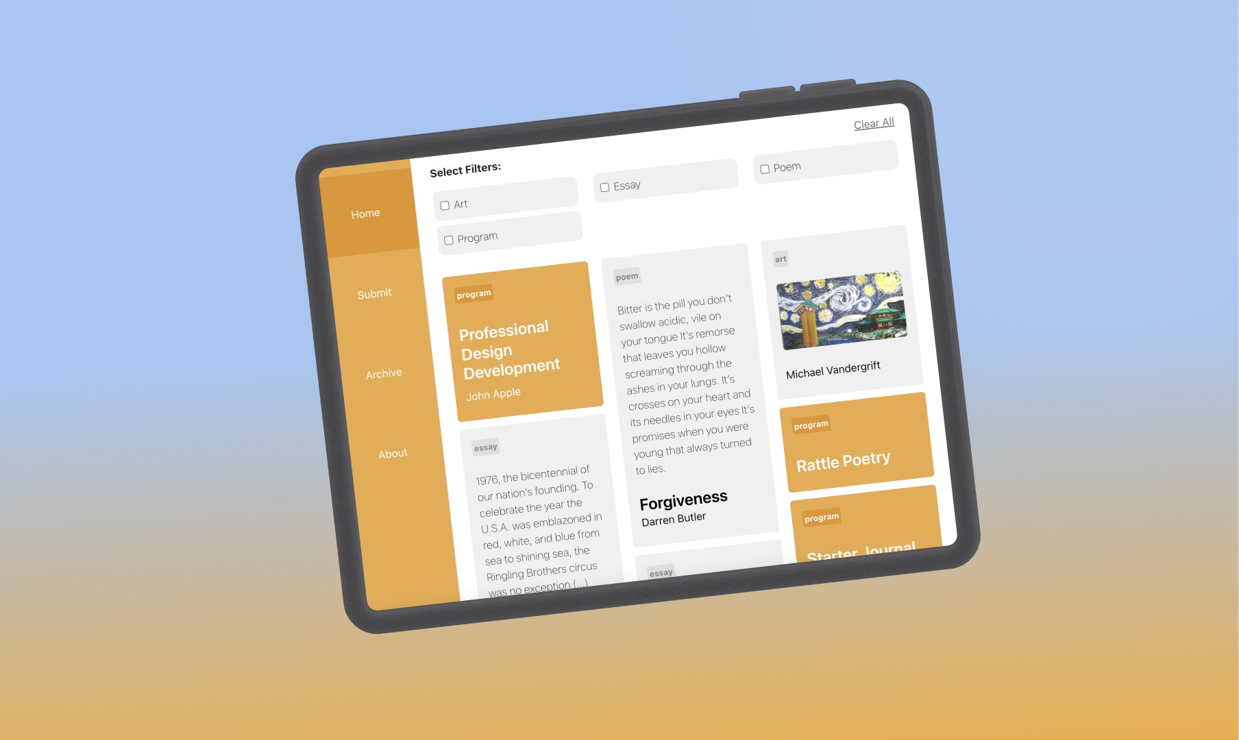
Clarified filter functionality by adding a 'Select filters' label and checkboxes to each filter pill. We also updated the 'clear all' label with underlined text for clarity.
Differentiated between programs and newsletter entries by adding tags and distinct styles.
Distinguished Home and Archive pages by updating content and filters to reflect current and past entries.
Enhanced submission instructions with detailed steps for different programs.
Improved usability by adding a back button to assist low-tech users.

Aaffinity diagram identifying key themes:
Effective Initial Understanding
Program Recognition Challenges
Filter Usage Confusion
Archive Navigation Disorientation
Submission Process Oversight


The survey data affinity diagram consists of responses from our user survey, organized into sticky notes and grouped by theme.
FINAL DESIGN


Next Steps
If I had to chance to continue improving the Prisoner's Express project, I would prioritize further research on the communication limitations inmates face. This would help us refine the platform’s features to address their specific needs more effectively.
Some ideas I’d like to explore:
Enhanced communication tools: Developing features that allow inmates to interact with facilitators or fellow participants in a structured, supportive way, respecting the constraints of the prison environment.
Offline access to content: Given the limited internet access in correctional facilities, providing offline access to program materials or letter-based options would make the content more accessible.
Personalized recommendations: Offering tailored content based on inmates' program history and interests could boost engagement and make the platform more impactful for each individual.
Reflections
The importance of empathy in design cannot be overstated.
Reflecting on my experience designing for Prisoner's Express, I realize how critical it is to deeply understand the needs of an underserved user group. Working on a project that supports inmates reminded me how easy it is to overlook perspectives when designing products. Initially, we believed that focusing on a generalized user persona would be sufficient, but as we dove into more research, including interviews and feedback from people involved with inmate programs, it became clear that there was so much more to learn.
Designing with empathy for this particular group expanded my understanding of user needs, and I will carry this mindset into future projects—recognizing that there is always more to explore, especially when creating for communities often left behind by mainstream design processes.
"My name is Miguel Velasquez. I’m 22 years old (23 next month) and I’ve been incarcerated since I was sixteen years of age. I’m serving a 25 to life sentence. I haven’t been able to give back to my community much since I’ve been in, but it doesn’t mean I don’t want to.
I’ve never been able to be a part of something positive as a youth. With the environment you guys have created with this program I feel like I’m part of something positive and it gives me hope.
A lot of individuals have given up hope on prisoners, but as for me I believe in the good I am capable of and I see you guys believe the same. I appreciate your time in this."
—Miguel Velasquez